FreeTikZ
Posted by Tom Leinster
guest post by Chris Heunen
I don’t have to tell you, dear -Category Café reader, that string diagrams are extremely useful. They speed up computations massively, reveal what makes a proof tick without an impenetrable forest of details, and suggest properties that you might not even have thought about in algebraic notation. They also make your paper friendlier to read.
However, string diagrams are also a pain to typeset. First, there is the entrance fee of learning a modern LaTeX drawing package, like TikZ. Then, there is the learning period of setting up macros tailored to string diagrams and internalizing them in your muscle memory. But even after all that investment, it still takes a lot of time. And unlike that glorious moment when you realise that you have cycled about twice the circumference of the Earth in your life, this time is mostly wasted. I estimate I’ve wasted over 2000 string diagrams’ worth of time by now.
Wouldn’t it be great if you could simply draw your diagram by hand, and have it magically converted into TikZ? Now you can!
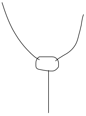
Meet FreeTikZ. It uses the magic of SVG, HTML, and Javascript, to turn
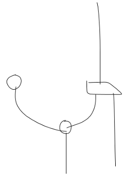
into the following LaTeX code:
\begin{tikzpicture}
  \node[dot] (d0) at (4.25, 5.5) {};
  \node[dot] (d1) at (6.25, 3.8) {};
  \node[morphism] (m0) at (7.5, 5.3) {};
  \draw (d0.center) to[out=-90, in=180] (d1.center);
  \draw (d1.center) to[out=60, in=-90] (m0.south west);
  \draw (m0.south east) to[out=-60, in=90] (8.25, 2);
  \draw (m0.north) to[out=90, in=-90] (7.5, 8.8);
  \draw (d1.center) to[out=-90, in=90] (6.25, 1.8);
\end{tikzpicture}
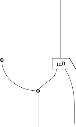
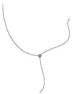
which turns into the following pdf:
Neat, eh?
Some things to notice. To help LaTeX make sense of things like \node[dot] and \node[morphism], you will need a small latex package. This defines the shapes of the nodes. You see that FreeTikZ is geared towards morphisms that can be rotated four ways, and dots for Frobenius algebras. If you prefer different shapes, such as rectangles with a marked corner instead of morphisms, or ribbons instead of wires, or cobordism-style pictures instead of dots, this is the place to change that.
You can only draw or erase in FreeTikZ, as if you were working on paper. There is no way to move dots around once they are drawn, or to change the colour of things, or to write labels anywhere. The idea is that you use a touchscreen, or stylus, or mouse, to draw your diagram. After that, you can tweak the LaTeX code by hand, moving morphisms around, changing angles, adding labels, or whatever you like. So you still need to know a bit of TikZ, but this is much faster than typesetting your diagram from scratch. (If you really wanted, you could load the LaTeX code into TikZiT, and change the diagram with your mouse before going to your actual LaTex file and using your keyboard.)
Finally, you can download the whole source, so you can also use FreeTikZ locally. Handy for when you don’t have an internet connection, en route to your conference, desparately making slides.
How does it work?
To let this post not completely be a blatant commercial, let’s briefly explain how FreeTikZ works. Up to some webpage bookkeeping and generating LaTeX code, the heart of the algorithm solves the following problem. You’re given a list of strokes, each stroke being a list of vectors in . For each stroke, you’re asked whether it is a dot, a morphism (and if so in which orientation), or something else (that is, a wire, and if so what it connects).
How does it do that? First we compute some numerical properties of the stroke. Thinking of the stroke as spanning a polygon, we can calculate some basic properties:
From those, we can find some more advanced properties.
- Compactness: This has nothing to do with topological compactness. Instead it measures “how close together” the points of the stroke are. For example, a circle will be very compact, but a straight line will not.
- Eccentricity is another fundamental characteristic of polygons. It measures the shortest distance between a point and all others, and takes the maximum of that over all points.
The two most useful properties for us are the following.
- Rectangularity is the ratio between the area of the polygon itself and the area of the smallest rectangle that contains it. So a perfect rectangle will have rectangularity 1, whereas a straight line will have rectangularity 0.
- Circularity is the ratio between the area of the polygon itself and the area of the smallest circle that contains it. So a perfect circle will have circularity 1, whereas a straight line will have circularity 0.
We then make a simple decision. If circularity is high enough and rectangularity low enough, then our stroke is probably a dot. If rectangularity is high enough and circularity is low enough, it is probably a morphism. (In that case, we can find out its orientation by checking whether the centroid is left/right/above/below the point furthest from the centroid.) Otherwise, we leave the stroke as a wire.
Can it be improved?
This simple decision procedure is a terrible hack, but it seems to work well enough. It would be better to train a support vector machine to make the decision for us based on all these numerical characteristics. Indeed, this is what Ruiting Cao did for her MSc thesis project, on which FreeTikZ is based. Similarly, there are other areas for improvement, but the current heuristics seem to work well enough.
Right now dots and morphisms need to be drawn in a single stroke. If you take your stylus/finger/mouse off the screen when drawing a wire, it will end up as two wires. Segmenting and joining strokes cleverly could improve the recognition.
If you would like a graphical language with more shapes than just dots and morphisms, you could tweak the characteristic properties, or ideally train and use a state vector machine.
Wires are simplified in a somewhat buggy way. You’re given a stroke with many many points. But we would like the LaTeX code not to have hundreds of points in it. At the moment wires are simplified as follows. Annotate each point with its incoming and outgoing angles. Then throw away all points that keep the same angle, up to a certain threshold. So if your stroke has angles 90, 90, 90, 90, 89, 87, 80, 60, 45, 40, 0, you would delete all points except the ones with angles 90, 60, 45, 0 (if the threshold is 30 degrees). But, for example, especially at the start of a stroke when the user just put the pen to the screen, the angle could be off, but that is the one that will be used. There are probably better heuristics.
Luckily, all you need to know is a little JavaScript to make FreeTikZ fit all your needs! What would you like to implement?



Re: FreeTikZ
In your example, the hand-drawn input shows a very nearly straight line at the bottom-right, but in the output it’s been converted into a gentle S shape. I think the output looks good, but I’m curious as to why this happened.
It makes me even more curious that the straightish line at the top-right of the input diagram seems (to my eye) to be slightly less straight than the one at the bottom right, and yet that one remains straight in the output diagram.
My guess: it’s something to do with the attachments to the four-sided box.