Skip to the Main Content

Note:These pages make extensive use of the latest XHTML and CSS Standards. They ought to look great in any standards-compliant modern browser. Unfortunately, they will probably look horrible in older browsers, like Netscape 4.x and IE 4.x. Moreover, many posts use MathML, which is, currently only supported in Mozilla. My best suggestion (and you will thank me when surfing an ever-increasing number of sites on the web which have been crafted to use the new standards) is to upgrade to the latest version of your browser. If that's not possible, consider moving to the Standards-compliant and open-source Mozilla browser.

September 3, 2016

Economy of Style

Posted by Tom Leinster

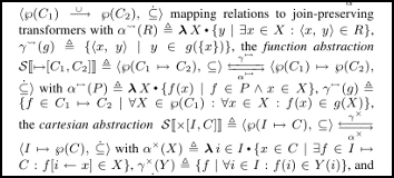
John Regehr writes: “holy cow this Cousot+Cousot paper achieves a density I’ve never before seen.” Me neither!

Excerpt from paper by Cousot and Cousot

Much of the paper looks like the snippet shown, except for the part where they take the time to explain that “e.g.” means “for example”. Read this Twitter thread for speculation on how this state of affairs came to be.

Posted at September 3, 2016 1:25 PM UTC
TrackBack URL for this Entry:   https://golem.ph.utexas.edu/cgi-bin/MT-3.0/dxy-tb.fcgi/2901

9 Comments & 0 Trackbacks

Re: Economy of Style

The symbology actually looks decipherable to me, but I didn’t see a statement of a theorem on a quick glance.

Posted by: Todd Trimble on September 3, 2016 3:33 PM | Permalink | Reply to this

Re: Economy of Style

I haven’t tried to read the paper and probably don’t have the expertise to do so. But in principle it could be perfectly clear, despite its exceptionally high density, and however much the formatting may give the impression that comprehensibility was not the authors’ top priority.

Posted by: Tom Leinster on September 3, 2016 5:46 PM | Permalink | Reply to this

Re: Economy of Style

I’m half-tempted, purely as an amusing exercise, to see if I could go through those first two pages (without looking ahead) and rewrite them. They honestly don’t look that formidable to me.

But also honestly, the other half will probably win. :-)

Posted by: Todd Trimble on September 4, 2016 1:34 AM | Permalink | Reply to this

Re: Economy of Style

Ha! If you try, we can discover how many pages it turns into when written out sensibly!

Apparently this paper has garnered an unusual amount of attention because of its extreme style. (E.g. see here.) It could be a really devious self-promotion move: make your paper look outstandingly incomprehensible, then stand back and watch stubborn academics take up the challenge of trying to comprehend it. A risky strategy, but original.

Posted by: Tom Leinster on September 4, 2016 1:59 AM | Permalink | Reply to this

Re: Economy of Style

hmmm. The twitter comments say:

James Wilcox ‏@wilcoxjay 20h20 hours ago

@johnregehr it was a keynote talk. definitely not a joke. my guess is that they were told “two page writeup if you want” and did a spit take

When I just downloaded the PDF, it started with 2 highly dense pages followed by 14 pages of (Auxiliary Materials) that are much better layed-out, though some still looks like it came directly from the first 2 pages. (and it looks like some of the font sizes on those 2 pages were shrunk to make the fit)

Posted by: RodMcGuire on September 3, 2016 9:55 PM | Permalink | Reply to this

Re: Economy of Style

Right. The first two pages are insane. The 14 pages of appendix are better formatted, but still have that Principia Mathematica look.

The bibliography is also fantastic.

Posted by: Tom Leinster on September 3, 2016 10:07 PM | Permalink | Reply to this

Re: Economy of Style

I attended that POPL. Each of the three keynote speakers were given a 2 pages for an abstract of their talk.

The keynote talk itself was very technical, but not at a level atypical for POPL. IIRC, many of the other keynotes (such as Lars Birkedal’s Milner award talk) were at a similar level of technical detail.

It is only their abstract which was formatted in this rather dense style, a choice which prompted considerable amusement among the attendees, in the “hey, you’ve got to see this!” sense. (I suspect this was partly the point.)

Posted by: Neel Krishnaswami on September 5, 2016 3:29 PM | Permalink | Reply to this

Re: Economy of Style

To keep to their high standards of clarity, they should have explained that “e.g.” stands for “exempli gratia”.

Posted by: John Baez on September 9, 2016 6:57 AM | Permalink | Reply to this

Re: Economy of Style

FWIW, I asked the author about this. He said, “ah … a fine example of what not to do”. Apparently, he had a much longer write-up, but the conference organizers said only only 2 pages are available. Two pages you say? Let’s see if it fits.

Posted by: Radu Grigore on February 17, 2017 10:35 AM | Permalink | Reply to this

Post a New Comment